
Bringing Arrive to Life
The launch of Arrive in early January was the culmination of months of work for our creative team. Rich McClellan, our VP Creative Director, explains why we chose the name Arrive and how it came to life.
What prompted the company’s decision to create Arrive?
When ParkWhiz parked its first car in 2007, route planning and in-car connectivity services were theoretical or, at best, luxuries. Today, these are essential components of people’s journeys. While our ParkWhiz and BestParking apps are strong, we - as a company - believe the future of parking and other mobility-related services lies within vehicles, navigation systems and other touchpoints. As a result, we decided that we needed a new way to talk about ourselves and the platform-based business we have worked to grow over the last several years.
Can you explain the steps you took to identify the name?
Naming is hard. I admire any company that makes this their business! No matter what you like, or what you think is perfect and brilliant, running it through the filter of what is already out there, taken or trademarked is a humbling experience.
To bring Arrive to life, we followed a few steps:
- First, we started big. We looked at hundreds of names spanning categories from the descriptive, to metaphors, conceptual and off-the-wall ideas. We asked employees across the company with different disciplines to share their ideas for variety.
- Then, we weeded it down by removing any unavailable names due to conflicts.
- Next, we identified the top six options, we solicited input once again from leadership.
- Finally, we selected the top three, which were submitted for trademark approval.
What is the meaning of Arrive?
Arrive is an intentionally broad and ambiguous name. There is an inherent positivity to it, an aspirational take on the end of a journey. It infers travel, yet is not weighted to either navigation or parking. Arrive describes where we currently are as a company, but is big enough to grow with us as we continue to add layers of functionality within and beyond parking.
Can you describe the brand look and feel? What tone were aiming to achieve?
With Arrive, we wanted to be bigger - establishing the brand as more than just a means of parking, but as a facilitator of a lifestyle. We like to say that parking is not the end point of a journey, but a transition between what you have to do to get there and what you want to do when you’re there. We opted to focus on the aspirational moments of when you arrive at your destination using unique photography perspectives and situations, and a bright and limited color palette.
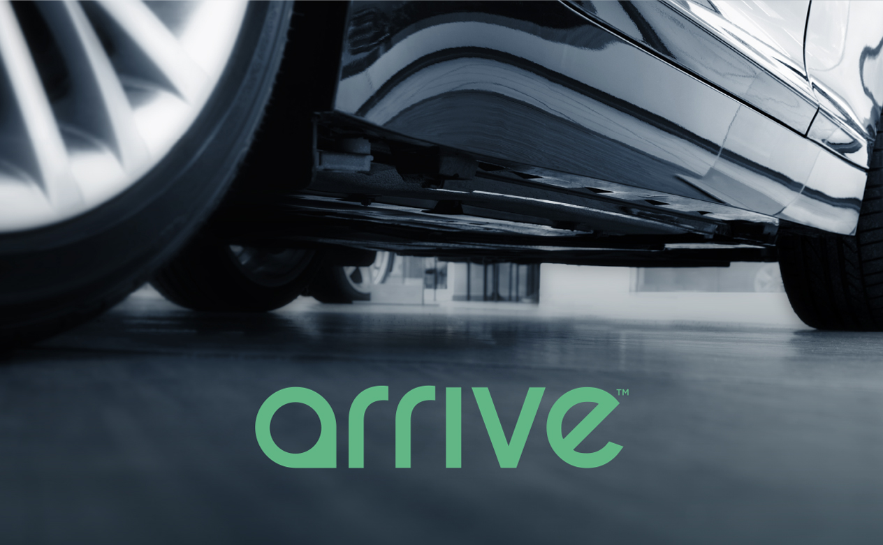
Can you explain the logo?
All strong logos tend to have one single feature that makes them stand out. For example, the hidden FedEx arrow, the bite out of the Apple logo or the Amazon “A to Z” smile.
We went through hundreds of iterations of some really interesting, complex, and interpretive logos. In the end, we came back to a really simple mark that borrowed from the pin drop icon in our ParkWhiz and BestParking apps. Pin drops in logos are certainly not a unique, but by turning ours 90 degrees counterclockwise, it became a subtle and nearly invisible letterform - the A in our logo. It seemed an obvious and inevitable way of using a universally recognizable icon to telegraph mobility, navigation and a destination. It’s a way of hinting at what our company does, without limiting ourselves to automobile icons, signs or parking spaces.